2020 Color Trends to Try
It is a brand-new decade, and paint companies all over the globe have officially released their picks for the colors that will be trending in 2020. Taking into consideration such influences as technology, pop culture and architectural trends, choosing a favorite shade was an exciting task. The end of a decade makes it even more relevant, as the chosen hues often become representative of an entire era, much like the pastels of the ’60s and neons of the ’80s.
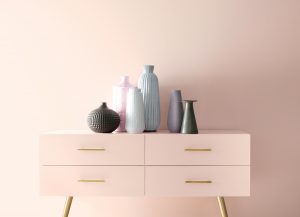
This year’s colors have changed in more ways than one. The emphasis has turned from how a color looks in a room, to how a color makes you feel in a space. Grays seem to be trending out, being replaced with “cozier” shades. According to the vast majority of interior designers, black is now a neutral color, ushering in an era of darker normal like navy blue, sage green, and blush pink.
There are many factors involved in choosing these special colors, including generational differences. Gen Z seems to be leaning toward bright yellows and oranges, Millennials are purchasing bold blues and purples, and Gen X seems to be holding onto the classic whites and beiges.
Here is the list of each of the major paint company’s top picks for the beginning of a new decade.
Benjamin Moore
First Light 2102-70
According to Benjamin Moore, First Light is a fresh alternative to whites and beiges. This soft pink is at the top of a list of nine other colors to round out Benjamin Moore’s Color Trends 2020 palette, including White Heron, Crystalline, Windmill Wings, Buxton Blue, Golden Straw, Thunder, Cushing Green, Oxford Gray, and Blue Danube.
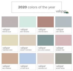
Valspar
The 2020 Collection
This year, Valspar upped its game by choosing not one color, but a 12 shade collection for the year. The colors are inspired by nature and are considered calming and practical. “Earth’s prescription for the chaotic, busy lives we all live, is to bring the tranquility of nature and the outdoor world into the home,” says Sue Kim, Valspar Color Marketing Manager.
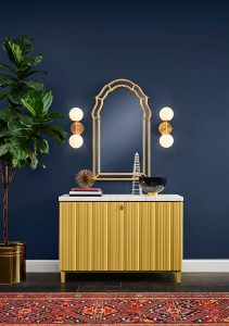
Sherwin Williams
Naval
Considered to be one of the most calming colors, Sherwin Williams chose Navy Blue is a fitting favorite for the start of the new decade. A rich, inspiring color that satisfies a need for relaxation and retreat, Sherwin Williams’ Naval is perfect for accent walls, kitchen cabinets, or a retreat like a bedroom with white trim.
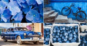
Pantone
Classic Blue
Undisputed leader in color, Pantone has been guiding millions of designers and producers since their first, “Color of the Year” announcement in 1999. Striving to find a calming hue in a world dominated by technology, Pantone has chosen Classic Blue. The 2020 Pantone color of the year is intended to reflect a “desire for a dependable and stable foundation on which to build as we cross the threshold into a new era,” according to a press release from the company.
For more great, home décor ideas, or to consult with one of our knowledgeable associates, visit us in one of our showrooms or check out our webpage at https://www.haynesbrosfurniture.com/
Leave a Reply